 17-07-2016, 08:32 PM
|
||||
|
|
||||
|
I don't think it looks too bad tbh.
|
|
17-07-2016, 09:17 PM
|
|||
|
|
|||
|
Quote:
|
|
17-07-2016, 09:51 PM
|
|||
|
|
|||
|
I'd go with 06-07 as the last genuinely nice United shirt.
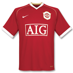 Of course it helps more when you have some good memories of the shirt, which is why I think a lot of people remember the 07-09 shirt (that, and the fact it was the last time the robbing bastards had a shirt for more the one year) |
|
17-07-2016, 11:08 PM
|
||||
|
|
||||
|
That was better, but 2007/09 was still good. Not unlike the team, as you say

|
|
21-07-2016, 06:12 PM
|
||||
|
|
||||
|
|
|
21-07-2016, 06:14 PM
|
||||
|
|
||||
|
Quote:

|
|
21-07-2016, 06:28 PM
|
||||
|
|
||||
|
Might come out of retirement so I can get this.
 
|
|
21-07-2016, 06:42 PM
|
||||
|
|
||||
|
Quote:
Don't mind it tbh |
|
21-07-2016, 06:52 PM
|
||||
|
|
||||
|
Quote:
|
|
21-07-2016, 07:51 PM
|
||||
|
|
||||
|
Quote:
|
|
21-07-2016, 08:55 PM
|
||||
|
|
||||
|
|
|
21-07-2016, 09:11 PM
|
|||
|
|
|||
|
Looks alright there tbf
|
|
21-07-2016, 09:28 PM
|
|||
|
|
|||
|
Looks good. Martial
|
|
21-07-2016, 09:31 PM
|
|||
|
|
|||
|
Hexagons?
|
|
21-07-2016, 09:36 PM
|
||||
|
|
||||
|
Quote:
|
|
21-07-2016, 09:40 PM
|
||||
|
|
||||
|
Quote:
|
|
21-07-2016, 09:42 PM
|
|||
|
|
|||
|
Not Hexagon House Blackely then?
|
|
21-07-2016, 09:43 PM
|
||||
|
|
||||
|
Quote:
|
|
21-07-2016, 10:07 PM
|
|||
|
|
|||
|
Quote:
It looks shite You mean the shape of honeycomb btw |
 |
 Similar Threads for: New kits 2016...
|
||||
| Thread | Thread Starter | Forum | Replies | Last Post |
| New Kits 22/23 | Lok | Football | 111 | 10-02-2023 12:20 PM |
| Other new kits 19/20 | Chorlton74 | Football | 94 | 13-11-2019 10:33 AM |
| *Official Match Thread 2016/17* - Manchester United v Stoke City 02/10/2016 | Sparky*** | Manchester United Match Thread Archive | 590 | 05-10-2016 12:53 PM |
| *Official Match Thread 2016/17* - Manchester United v Zorya Luhansk - 29/09/2016 | Sparky*** | Manchester United Match Thread Archive | 388 | 01-10-2016 11:52 AM |
| New united kits 2016 | saffers | Football | 53 | 12-05-2016 09:41 AM |


